

PRODUCTIVITY SAAS · DESIGN + BUILD · 2024
Cadence
A focus-timer app with real fans and a landing page that undersold it. A rebuild that finally made the pitch as sharp as the product.
- CLIENT
- Cadence, remote
- ROLE
- Design, development, messaging
- TIMELINE
- 6 weeks
- OUTCOME
- 2.6× free-trial starts
THE PROBLEM
Cadence had a loyal following and a landing page that read like a feature list written by the engineers who built it. Visitors who’d have loved it bounced, because the page explained what the app did instead of what it was for.
Trial starts were flat while word-of-mouth quietly carried the whole business.
THE APPROACH
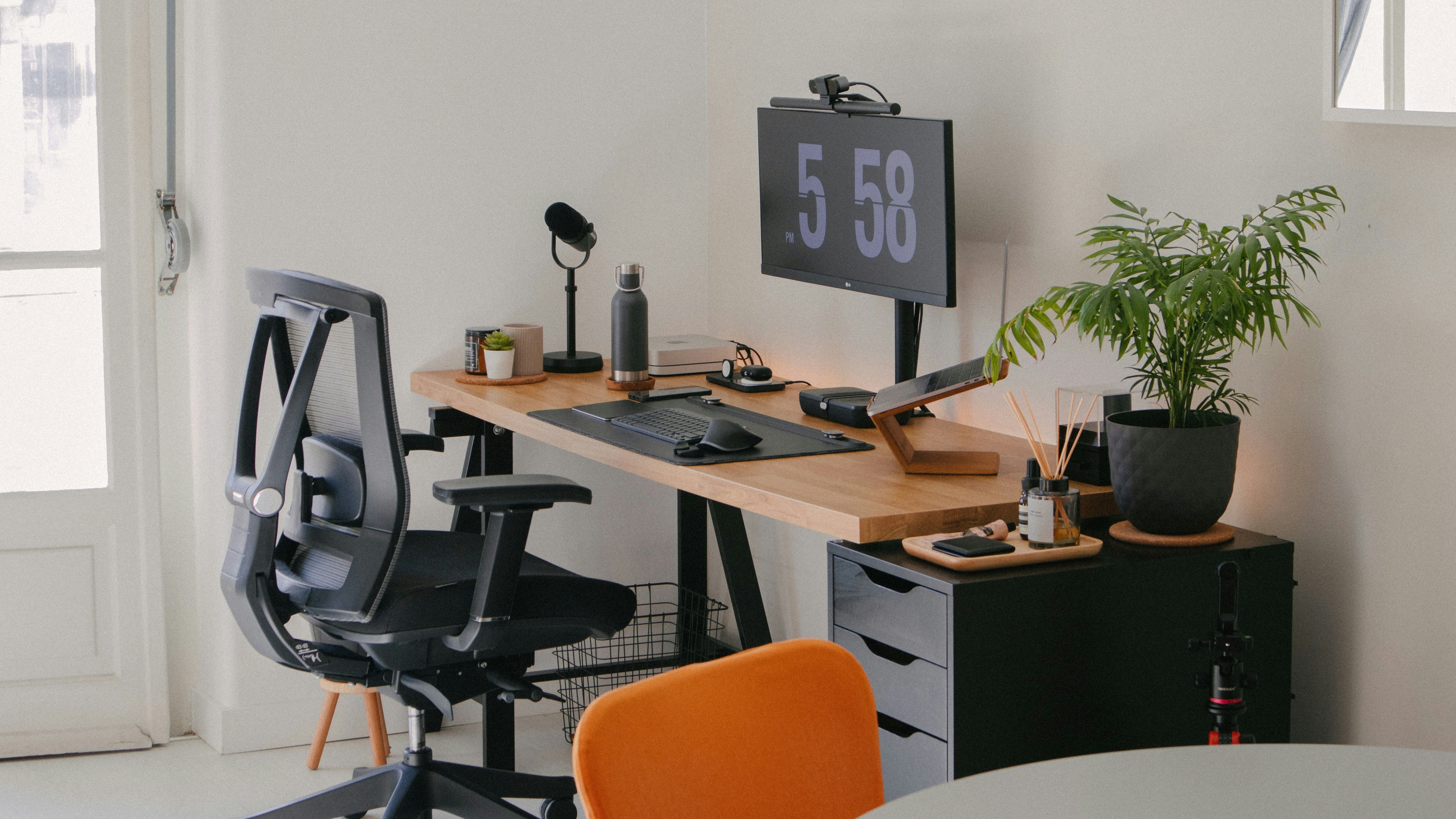
I threw out the feature grid and led with the feeling users kept describing: a calm, ticking rhythm to the workday. The copy sells the outcome; a single honest product shot does the demoing.
The build is static-first and instant — the page paints before the old one had finished measuring its hero video — so the app’s promise of focus is felt before it’s read.
THE OUTCOME
Trial starts more than doubled in the first month, driven by the same visitors the old page had been losing at the headline.
“He described our app back to us better than we ever had. Then he shipped the page that says it.”